The Elegance of the Hedgehog by Muriel Barbery has a firm spot in the list of best books I've ever read, it might just be the very best one. It is the second book to have ever made me cry (the first one was East of Eden by John Steinbeck) and when just the words on a page have the power to do that then you definitely know you've struck upon something great.
So for portfolio class, I decided to make my own cover for it and here it is!
For the sake of brevity, here's the story in a nutshell: Renee Michel, is the concierge of a posh apartment building in Paris. She is an autodidact with beautifully deep thoughts yet she shows others the image of an ignorant, stereotypical concierge who owns a fat lazy cat and who can do nothing but watch T.V. all day.
So I wanted to portray the existence of the her two identities through the space that she inhabits. The front cover is her true self (the inside of her apartment that nobody sees) and the back cover is the image of herself that she shows to others (the entrance to the apartment, which the tenants get to see periodically). So the front and the back are just different sides of the same room.
I am very, very pleased with the result. I consider this piece to be the culmination of everything I've learned about art and design here at SCAD. It has everything I have been working towards in terms of style and technique. I got the linework, the mark-making, the values, the colours, the textures, the shapes, the perspective, the composition and the type JUST how I wanted them. And that just feels great, to finally have figured it all out.
And since I enjoy reading so much, I was happy to make a book cover that I would enjoy seeing at the store. See the cat on the ISBN bar? I LOVE it when publishers incorporate the cover design with the bar. They should do it more often!
Here's some of my process work:
This was the initial thumbnail. I had a very clear image in my mind of what I wanted and the final piece changed very little from this original thumbnail, it is not often that this happens...in fact, I think it's the very first time this has ever happened to me in the illu department haha. The only big suggestion I got was to move the cat and then I got all excited when I realized I could put him on the ISBN bar!
This was the comp, I drew all the elements out in individual pieces of paper so that I could play around with the composition more freely.
This is the value comp, as you can see, the values didn't turn out exactly like this in the end but having the comp is useful to give yourself an idea of where you want to go.
This is the colour comp and yes, it's quite sloppy but it's not always essential for it to be perfectly neat since all I needed to know was what colours worked well together. I tend to prefer colour comps that way because then I can concentrate ONLY on the colours without getting distracted by little drawing details. A problem I had is I was too influenced by the colours of the original cover from Europa Editions, so I was determined to stray away from that and make it my own. I did decide to keep the border from the original cover though because that adds a touch of elegance.
And then when all of the above was tweaked, critiqued, decided upon, I drew all the elements, this time around quite neatly, scanned them in, and the rest all happened in Photoshop.
:)
Friday, March 4, 2011
Saturday, February 26, 2011
Chocolate Milk Bottle Design
I have a penchant for consuming and enjoying chocolate and anything else you can make with it.
For Vector Illustration, we had to create a package design for a product of our choice, the most common example being a beer bottle and I said screw that, I want a milk chocolate bottle, a CUTE milk chocolate bottle... with a cute animal on it.
So I decided to use a bear! That was after many suggestions to use a rabbit (Nesquik, anyone?) Funny how all these products are so deeply ingrained in our minds yet we don't realize it until this happens, just like when I made the drawing for the mural and gave the crocodile a thumbs-up (there's a CR product with a crocodile mascot that gives you a thumbs-up.)
This was the original, brainstorming sketch:
My professor liked the idea, so he suggested I take advantage of the cuteness of the bear by turning it into a character (basically turn it into something personable that can sell the product, put a soul behind those eyes), so this is the revised sketch:
There was no need to sketch the body since I planned to make it by using basic geometric shapes on Illustrator to keep the edges clean for a label.
So after making use of the magic of Adobe Illustrator, I created my ideal chocolate milk label:
I also went on the FDA's website to find out the regulations for Nutrition Facts labels (very interesting from a typographic sense!) though I didn't follow them 100%.
Then I made a mock-up by digitally placing it on the actual container. I used a Starbucks frapuccino bottle because they are very cute and I've always wished they contained chocolate milk too:
A couple weeks ago I mentioned how a wood grain texture can very easily look VERY "Photoshoppy" but this time around I made it work.
I also had fun designing the logo for it. I originally wanted something simple and elegant but from a commercial stand point, even though there's a bear on the bottle and that's reason enough to initiate that spark of "Hmmm, what is this? Should I buy this?," the brand still has to stand out on its own. It became tricky at one point since the syllables "oco" and "oso" were right on top of each other and affected legibility by being so similar.
Also, name is a pun in Spanish. "Chocolatoso" means "chocolate-y" and "oso" means "bear," so there you go. I usually don't use Spanish in my projects but this time I made an exception because: 1) I love puns, 2) the name is easy enough that any English speaker can pronounce it without too much trouble (since I'm in the U.S.) 3) the basic understanding of CHOCOLATE is there for many other languages as well.
"it's bear-y delicious!"
For Vector Illustration, we had to create a package design for a product of our choice, the most common example being a beer bottle and I said screw that, I want a milk chocolate bottle, a CUTE milk chocolate bottle... with a cute animal on it.
So I decided to use a bear! That was after many suggestions to use a rabbit (Nesquik, anyone?) Funny how all these products are so deeply ingrained in our minds yet we don't realize it until this happens, just like when I made the drawing for the mural and gave the crocodile a thumbs-up (there's a CR product with a crocodile mascot that gives you a thumbs-up.)
This was the original, brainstorming sketch:
My professor liked the idea, so he suggested I take advantage of the cuteness of the bear by turning it into a character (basically turn it into something personable that can sell the product, put a soul behind those eyes), so this is the revised sketch:
There was no need to sketch the body since I planned to make it by using basic geometric shapes on Illustrator to keep the edges clean for a label.
So after making use of the magic of Adobe Illustrator, I created my ideal chocolate milk label:
I also went on the FDA's website to find out the regulations for Nutrition Facts labels (very interesting from a typographic sense!) though I didn't follow them 100%.
Then I made a mock-up by digitally placing it on the actual container. I used a Starbucks frapuccino bottle because they are very cute and I've always wished they contained chocolate milk too:
A couple weeks ago I mentioned how a wood grain texture can very easily look VERY "Photoshoppy" but this time around I made it work.
I also had fun designing the logo for it. I originally wanted something simple and elegant but from a commercial stand point, even though there's a bear on the bottle and that's reason enough to initiate that spark of "Hmmm, what is this? Should I buy this?," the brand still has to stand out on its own. It became tricky at one point since the syllables "oco" and "oso" were right on top of each other and affected legibility by being so similar.
Also, name is a pun in Spanish. "Chocolatoso" means "chocolate-y" and "oso" means "bear," so there you go. I usually don't use Spanish in my projects but this time I made an exception because: 1) I love puns, 2) the name is easy enough that any English speaker can pronounce it without too much trouble (since I'm in the U.S.) 3) the basic understanding of CHOCOLATE is there for many other languages as well.
"it's bear-y delicious!"
Sunday, February 20, 2011
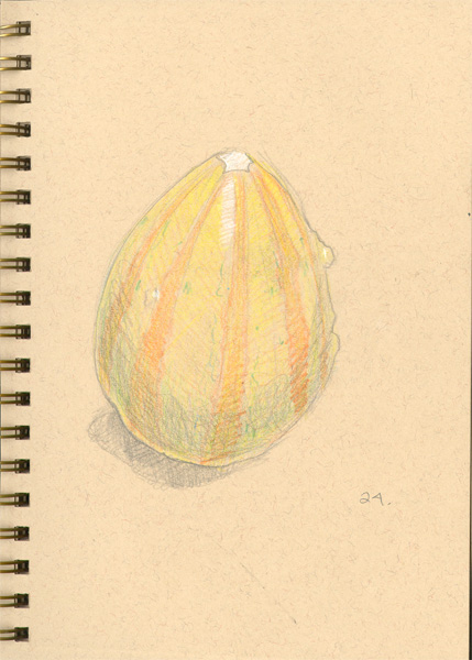
50/100 Sketches from Life
Been pretty busy this weekend but finally I'm able to post! This week I will share some snippets from my sketchbook "100 Sketches from Life." Also, if you've seen my website then you probably have seen a lot of these before.
It's been an enlightening and very fun experience so far, and it's great practice, too!
I chose a toned sketchbook for a few reasons. First, it's always been very hard for me to keep a sketchbook. The reason? It's hard for me to enjoy drawing on plain, stark white paper; it's very uninspiring to have this blinding sheet of paper staring at you. (For some reason I don't have this problem with loose sheets of paper.)
I realized this when I noticed I'd be more inclined to sketch on paper that already had something in it, like lined paper or a handout or something. Toned paper technically has something on it since it's coloured and it has these tiny little grains on it.
The other reason is I can use white charcoal on the toned paper, for highlights. This quickly and effectively gives the drawing a sense of volume and dimensionality. This can still be done on white paper but it is not instantaneous as on the toned paper.
For the most part, I've also been careful to choose objects which I find geometrically interesting. It makes the drawing much more fun when you can start off with basic geometric shapes and build it up into a more complex shape from that simple starting point.
There's lots of fruits and veggies too, they're quite fun to draw because of the textures and colour nuances in them.
So here is a selection sketches from the first half of the sketchbook. You can also find some of these on my website. Enjoy!
It's been an enlightening and very fun experience so far, and it's great practice, too!
I chose a toned sketchbook for a few reasons. First, it's always been very hard for me to keep a sketchbook. The reason? It's hard for me to enjoy drawing on plain, stark white paper; it's very uninspiring to have this blinding sheet of paper staring at you. (For some reason I don't have this problem with loose sheets of paper.)
I realized this when I noticed I'd be more inclined to sketch on paper that already had something in it, like lined paper or a handout or something. Toned paper technically has something on it since it's coloured and it has these tiny little grains on it.
The other reason is I can use white charcoal on the toned paper, for highlights. This quickly and effectively gives the drawing a sense of volume and dimensionality. This can still be done on white paper but it is not instantaneous as on the toned paper.
For the most part, I've also been careful to choose objects which I find geometrically interesting. It makes the drawing much more fun when you can start off with basic geometric shapes and build it up into a more complex shape from that simple starting point.
There's lots of fruits and veggies too, they're quite fun to draw because of the textures and colour nuances in them.
So here is a selection sketches from the first half of the sketchbook. You can also find some of these on my website. Enjoy!
Saturday, February 12, 2011
Bird Greeting Cards
Greeting Cards! Three of them! Birds!
Don't you love the titles?
I'm sorry for the watermarks, but you can check my website (which by the way has brand new colours too!) to see versions without them. This doesn't mean I'll put watermarks on everything from now on but I made an exception for these.
I went light on the graphite and heavy with the texture since I felt like this sort of style doesn't call much for the graphite value drawing. Plus I've been steadily building up my texture library and felt like experimenting with textures. My findings have revealed that ironically, a wood grain texture can look VERY "Photoshopy" when digitally treated like textures usually are. Hence, I didn't use it!
![]() |
"Under the weather" |
"You make my heart flutter"
graphite and digital, 7" x 5"
Don't you love the titles?
I'm sorry for the watermarks, but you can check my website (which by the way has brand new colours too!) to see versions without them. This doesn't mean I'll put watermarks on everything from now on but I made an exception for these.
I went light on the graphite and heavy with the texture since I felt like this sort of style doesn't call much for the graphite value drawing. Plus I've been steadily building up my texture library and felt like experimenting with textures. My findings have revealed that ironically, a wood grain texture can look VERY "Photoshopy" when digitally treated like textures usually are. Hence, I didn't use it!
Saturday, February 5, 2011
Charles Bukowski - Vector Illustration
So I decided to re-do an old piece for Vector illustration (with professor John Foerster) and here it is.
Here's the story behind it. Exactly two years ago in the Winter quarter of 2009, I took my very first illustration class, Drawing and Design for Illustrators with Professor Daniel Powers. We had to pick a Charles Bukowski poem to illustrate, I picked:
coupons, by Charles Bukowski
cigarettes wetted with beer from
the night before
you light one
gag
open the door for air
and on your doorstep
is a dead sparrow
his head and breast
chewed away.
hanging from the doorknob
is an ad from the All American
Burger
consisting of several coupons
which
say
that with the purchase
of a burger
from Feb. 12 thru Feb. 15
you can get a free
regular size bag of french
fries and one
10 oz. cup of coca cola.
I take the ad
wrap the sparrow
carry him to the trash bin
and dump him
in.
look:
forsaking fries and coke
to help keep
my city
clean.
We were limited to one coloured paper, one different colour of pastel, and black and white pastel.
And this is what I did:
Ehhhhh.... Loved the idea and the colours but awful execution.
....
But that was two years ago!
In doing this I discovered that re-doing or revisiting an illustration is not as simple as it may sound (it certainly doesn't sound like it to me anymore.) There is so much that lead up to the execution of this piece that I don't even know where to begin. One thing I will say is I do miss the old colours but I think those were effective because of the pastels, which gave them a nauseating, grungy quality even though they were such bright, happy colours. It is somewhat frustrating to do this twice and still not feel 100% pleased with it, but I definitely learned a lot from this whole process. I almost want to re-do it again in my usual graphite technique, which would definitely give it that grungy feeling but it's probably best to move on to new pieces for now.
Here's the story behind it. Exactly two years ago in the Winter quarter of 2009, I took my very first illustration class, Drawing and Design for Illustrators with Professor Daniel Powers. We had to pick a Charles Bukowski poem to illustrate, I picked:
coupons, by Charles Bukowski
cigarettes wetted with beer from
the night before
you light one
gag
open the door for air
and on your doorstep
is a dead sparrow
his head and breast
chewed away.
hanging from the doorknob
is an ad from the All American
Burger
consisting of several coupons
which
say
that with the purchase
of a burger
from Feb. 12 thru Feb. 15
you can get a free
regular size bag of french
fries and one
10 oz. cup of coca cola.
I take the ad
wrap the sparrow
carry him to the trash bin
and dump him
in.
look:
forsaking fries and coke
to help keep
my city
clean.
We were limited to one coloured paper, one different colour of pastel, and black and white pastel.
And this is what I did:
Ehhhhh.... Loved the idea and the colours but awful execution.
....
But that was two years ago!
Friday, January 28, 2011
Crocodile Zoo Poster
I chose to do a series of animal-themed illustrations because I really enjoy drawing them but I realized my current portfolio doesn't reflect that as much as I'd like.
The first of the series is this poster for a zoo, featuring crocodiles and an Egyptian plover!
I am very happy with how this piece turned out since I accomplished every single goal I set for it. I used a very systematic approach of: thumbnails, a preliminary sketch, a refined sketch, a value comp, and finally a colour comp. It's basically doing research on yourself and your art before you even begin the final piece. It also printed out true to the colours on the screen which is always a plus! Aaaand I also left enough space for the possible addition of type in the future.
Saturday, January 15, 2011
Community Service Mural!
So here is the other piece of GREAT news! I painted my very first mural!
The main reason why this makes me so happy and so excited is I've always wanted to paint one.
The other reason is this was all for community service at a nursery :) I know I loved being surrounded by cute, happy imagery as a child and I strongly believe every child deserves to be happy, so the fact that I was able to brighten up their nursery makes me very happy as well.
Plus, I love seeing murals, in a house, out in the city, anywhere. They really liven up a wall in otherwise dull environments.
The nursery, called CEN CINAI, is one of the many such government-sponsored nurseries for people with low resources in Costa Rica. They promote good nutrition and education in a healthy, positive environment. My friend Silvia (who by the way I've known since first grade, longest-lasting friendship I have!) is studying to become a dentist and she frequently visits them to teach the children how to brush their teeth correctly.
We had the pleasure to paint the wall of the basin they use to wash their hands and brush their teeth. The main goal of our mural was to remind them to brush their teeth with happy imagery. The other aim was simply to lighten up that corridor with bright colours since it's somewhat dark and sad in there.
At the request of the nursery's director, we kept the imagery quite simple, nothing too technical or any elaborate.
This was the sketch we presented, I originally tried for a more dynamic, rule of thirds-y composition but had to switch it around to fit certain requests, such as adding the balloon and removing the crocodile hahaha. Hey, hey, I figured a crocodile would be awesome for dentistry since he has all these nice shiny teeth, right? (Or maybe I just really like big reptiles with lotsa' teeth.)
I then drew these bunnies and this kangaroo and had the children pick which one they liked the most. They all picked the kangaroo. I drew a kangaroo since my mom said she read this article about a new tooth brush for kangaroos. She asked us how we imagined such a tooth brush, since she imagined it'd have to be quite long so the kangaroo wouldn't bite the person, haha. I can't verify the authenticity of this article but I thought the story was hilarious.
The hot air balloon was included since Silvia loved this drawing I had in my sketchbook (I have a not-so-secret yet not-so-publicized love for hot air balloons and I frequently sketch all sorts of them.)
And here is the finished product:
It was challenging at times to try and concentrate on painting while simultaneously taking care of curious children who wanted to get their hands all over the paint, haha. There's many things I would've done differently (even though I made the drawing, I didn't have full creative control over it.) Even so, we accomplished our goals. Teeth, happy imagery, bright colours and happy people. All the staff and the few children that saw it were happy with it, which in the end is what matters since this was done for them.
I say the few children that saw it since they were let out on break on the day before we finished the mural, so I left with the thought that it would be a nice little surprise or late Christmas present for them when they got back from vacation. :)
It was such an enriching experience. Seeing the happy, brightened faces of not just the children but also the staff was very fulfilling for both of us. They were all very satisfied and we received many positive comments. They even mentioned something about having us come back to do more. And hey, there's CEN CINAI all over the country, so why not?
We even got a bag of candy!
The main reason why this makes me so happy and so excited is I've always wanted to paint one.
The other reason is this was all for community service at a nursery :) I know I loved being surrounded by cute, happy imagery as a child and I strongly believe every child deserves to be happy, so the fact that I was able to brighten up their nursery makes me very happy as well.
Plus, I love seeing murals, in a house, out in the city, anywhere. They really liven up a wall in otherwise dull environments.
The nursery, called CEN CINAI, is one of the many such government-sponsored nurseries for people with low resources in Costa Rica. They promote good nutrition and education in a healthy, positive environment. My friend Silvia (who by the way I've known since first grade, longest-lasting friendship I have!) is studying to become a dentist and she frequently visits them to teach the children how to brush their teeth correctly.
We had the pleasure to paint the wall of the basin they use to wash their hands and brush their teeth. The main goal of our mural was to remind them to brush their teeth with happy imagery. The other aim was simply to lighten up that corridor with bright colours since it's somewhat dark and sad in there.
At the request of the nursery's director, we kept the imagery quite simple, nothing too technical or any elaborate.
This was the sketch we presented, I originally tried for a more dynamic, rule of thirds-y composition but had to switch it around to fit certain requests, such as adding the balloon and removing the crocodile hahaha. Hey, hey, I figured a crocodile would be awesome for dentistry since he has all these nice shiny teeth, right? (Or maybe I just really like big reptiles with lotsa' teeth.)
Note: this was coloured after the sketch was approved.
Note: these were coloured after the sketch was approved.
I'm glad they chose the kangaroo since I wasn't too intent on painting a rabbit (Mr. Rabbit from Colgate, anyone?) Showing them these sketches was hilarious because they'd walk over and they couldn't believe I drew them. I was surprised only one of them asked how though.
The hot air balloon was included since Silvia loved this drawing I had in my sketchbook (I have a not-so-secret yet not-so-publicized love for hot air balloons and I frequently sketch all sorts of them.)
And here is the finished product:
It was challenging at times to try and concentrate on painting while simultaneously taking care of curious children who wanted to get their hands all over the paint, haha. There's many things I would've done differently (even though I made the drawing, I didn't have full creative control over it.) Even so, we accomplished our goals. Teeth, happy imagery, bright colours and happy people. All the staff and the few children that saw it were happy with it, which in the end is what matters since this was done for them.
I say the few children that saw it since they were let out on break on the day before we finished the mural, so I left with the thought that it would be a nice little surprise or late Christmas present for them when they got back from vacation. :)
It was such an enriching experience. Seeing the happy, brightened faces of not just the children but also the staff was very fulfilling for both of us. They were all very satisfied and we received many positive comments. They even mentioned something about having us come back to do more. And hey, there's CEN CINAI all over the country, so why not?
We even got a bag of candy!
"Merry Christmas!"
Subscribe to:
Posts (Atom)