A full deck of cards, all 52 cards, plus 2 jokers, PLUS a box to put them in AND a poster to advertise them... All made entirely out of letterforms! So all you see below here is absolutely all letters, nothing else.
I chose Esprit because I wanted a Transitional typeface that wouldn't be too stiff (since I had stiff, mechanical Bodoni last project) and Esprit was absolutely perfect. It's straight and serious enough but still has little flourishes.
Here is a sample of the cards I made:
Sorry for the nasty watermarks. Also, blogger seems to mute down the colours a bit.
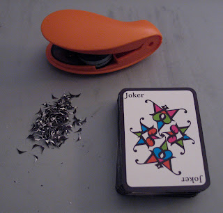
I printed them out, cut them all, and clipped the corners, took forever!
And this is the backside of the cards:
I actually have two versions of the cards. The other version is based on the traditional playing card approach (you still get the corresponding number of the suit's symbol in each card, but they're all the same size.) I used this approach you see above since every individual card becomes more immediately intense that way, as if each card were an individual poster. Basically, with the traditional approach, they all blend in like a crowd, this way they come out as individuals.
When choosing the colours, I was thinking of chocolate and what combination of colours made me hungry. I even dismissed certain combinations simply because they made me nauseous. Gladly a girl in my class picked up on the "hungry" colours. She said they were all chocolate with blueberry, mint, raspberry and orange.
The beauty of working with Illustrator is nothing is set in stone, so I have also planned another version of the colours that is somewhat lighter than these; they'll be even more candy-like then!
All images and designs ©Tatiana Dengo 2010. All rights reserved.


No comments:
Post a Comment